Software
How a letter shape becomes pixels, and why it looks different everywhere
A font stores outlines, not pictures. Turning a smooth curve into a grid of square pixels is a decision, and every system decides differently.
This is written to be used rather than admired. Each section below is a decision about font rendering, and each one has a default.
Before you start
- Glyphs are stored as mathematical outlines, independent of size.
- Hinting distorts outlines deliberately to align them with the pixel grid.
- Antialiasing trades sharp edges for smoother apparent shapes.
A font is a set of outlines and instructions
Each character is stored as a set of curves and straight segments describing the boundary of the shape to be filled. Because the description is mathematical, one definition serves every size without any loss of detail at large sizes. The font also carries metrics describing how much horizontal space each glyph occupies and how glyphs sit relative to each other.
Additional tables describe adjustments between specific pairs and substitutions that combine characters into single shapes. None of this specifies pixels, because the font has no idea what device will eventually display it.
The grid is the problem
Rasterising means deciding, for every pixel, how much of it falls inside the outline and what value to give it. At large sizes this is easy, since a stroke covers many pixels and small errors at the edges are invisible. At small sizes a stem may be narrower than a single pixel, and its position relative to the grid changes its appearance completely.
A stem centred on a pixel boundary spreads across two pixels and appears blurred, while one aligned to the grid appears crisp. Text at ordinary reading sizes on a low resolution screen lives entirely in this awkward region.
Hinting distorts the shape on purpose
Hints are instructions in the font that move and resize parts of an outline so features land on pixel boundaries. Applied well, they make stems uniform, keep baselines consistent and stop letters shimmering as they shift by fractions of a pixel.
In the datasheet, the cost is fidelity, because the shape being drawn is deliberately not the shape the designer originally drew. Hinting a font thoroughly is painstaking manual work, which is why many fonts carry only automatic hints or none. Some rendering systems ignore hints entirely and prioritise the designed shape, which is a philosophical difference rather than a bug.
Antialiasing and the colour fringes
Instead of deciding each pixel is in or out, antialiasing gives partial coverage a proportional grey value. This makes edges look smoother at the cost of making them less sharp, which many people read as blurry text. Subpixel rendering goes further by treating the separate red, green and blue elements of a pixel as three positions.
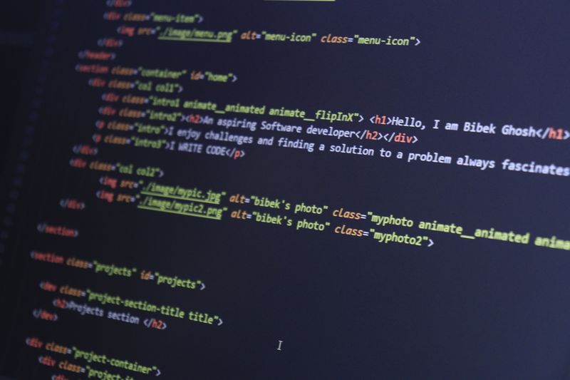
That triples horizontal resolution, and it produces coloured fringes visible if you look closely or photograph the screen.
It also depends on knowing the physical arrangement of the subpixels, so it fails on rotated screens and unusual panel layouts.
Why the same page looks bolder on one machine
Rendering engines apply different amounts of gamma correction, which changes how partially covered pixels are converted to displayed brightness. Some systems deliberately thicken strokes at small sizes so text remains legible, which reads as heavier type.
Under load, others preserve the designed weight and accept that small text is lighter, which reads as more faithful and less readable. The background colour matters too, since light text on dark ground appears to spread while dark on light appears to shrink. None of these choices is wrong; they optimise for different priorities and produce visibly different results from identical files.
Firmware updates change this behaviour more often than hardware does.
High resolution screens changed the problem
When a stem spans several pixels, alignment to the grid matters far less and the outline can be drawn as designed. Hinting therefore becomes less important, and systems on dense displays often reduce or ignore it entirely. Antialiasing remains useful for curves and diagonals but no longer needs to rescue the appearance of vertical stems.
Subpixel rendering has largely faded, since the horizontal resolution it borrowed is no longer worth the fringing it caused. The result is that typography on dense displays now looks much closer to print than to the text of a decade ago.
The takeaway
The font supplies a curve; the renderer decides what a curve means on a grid.
The constraint is almost always physical, and marketing rarely mentions which one.
Questions readers ask
Why does text look blurry after I change the display scale?
Rendering may be happening at one size and being stretched to another. Rendering at the target size directly avoids the resampling.
Why do my fonts look different in one application?
Applications can use their own rendering rather than the system's, with different hinting and antialiasing settings for the same font file.
Also by Junko Ishida
- USB-C solved the connector and not the confusionPower & Batteries
- File formats decide whether your files outlive the softwareSoftware
- Where the electricity goes when everything is switched offPower & Batteries
- The memory effect was real, and it has nothing to do with your phonePower & Batteries